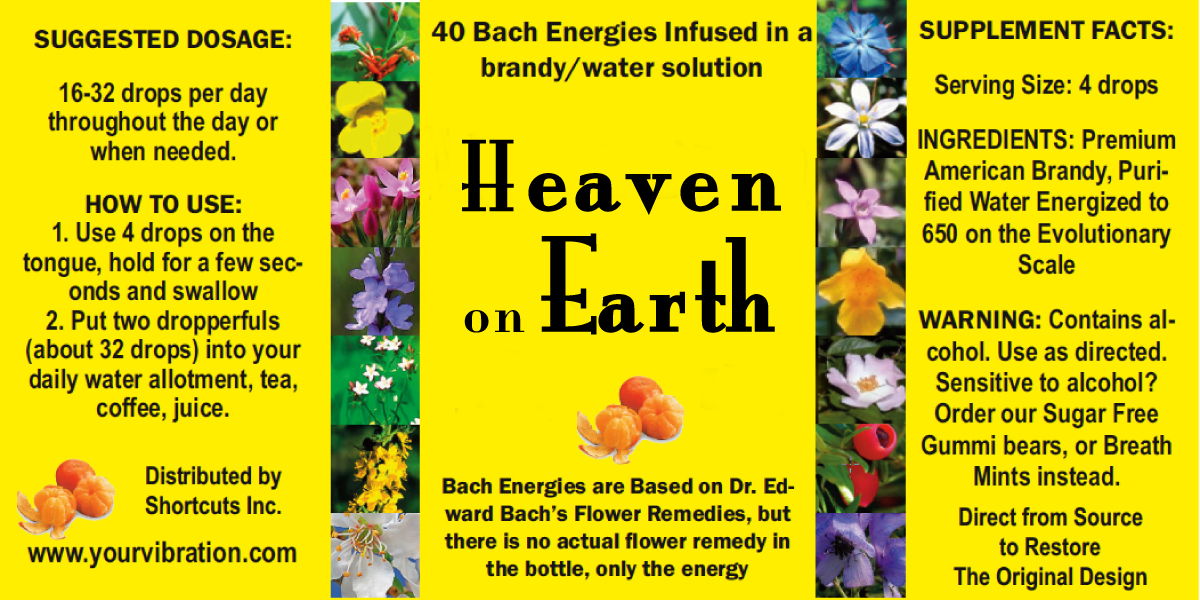
Finally I had a few hours for myself, so I whipped out my trusty old Quark Xpress that I hadn’t used for 5-6 years, and designed a label for the Heaven on Earth Remedy…

Here is how it is. Would you comment below and tell me
- if you like it
- if not what you don’t like about it
- if you think anything else should be on it, info, etc.
I’d really appreciate it, I don’t want to send it to the printer and then not love it… OK?
Please, and thank you.
As you can see, I have infused sugar free gummi bears, and sugar free breath mints, and it works. A gummy bear has enough oomph to last a day: just bite off a little bit each time you want to take the remedy. If I can buy gum drops, tiny little gummi stuff, sugar free, of course, I’ll use those as well.
I haven’t figured out what it must cost to be good both for you and me (after all I am doing all this office stuff myself at this point, and it is quite time consuming… eventually, with G-d’s help, (lol, an atheist’s prayer, lol) I’ll have some staff… but not just yet.)
First step will be to give it to people to test it.
Oh, and I tested something else today: I infused massage oil and body lotion with the Energizer and the Heaven on Earth, without the client’s knowledge, and a difficult client melted seconds after I applied the stuff… hey, it’s working! lol. Heaven on Earth, really.
Sophie~~~ I just received my remedy order… the new label design looks really, really good – it’s SO pretty! I love it!!
p.s. Thanks for always sending everything so quickly.
I am happy you love it.
My shipping policy is to send everything out the next shipping day. So far I have missed it only once or twice, when I didn’t have a ride to the post office. Now the mailman picks it up, and all goes like clockwork
I much prefer the white version – the yellow is a little too strong for my tastes. And I have to agree with Dorothy, the font on “Heaven on Earth” is a bit too hippy-looking – sorry!
Everything else looks great!
I like hippie looking, funky I call it. It suits ME well… it is white and it is hippie… lol
The last word is mine. thanks everyone for this group effort: it was lots of fun. muah
Private joke: I found myself irritated and bothered… lol (impervious? lol)
Here is the newest version. Although I like the Mona Lisa typeface, I love MINE… (2-year old?)
ok, here is the newest, and hopefully final version.
and here is the Mona Lisa I also liked
Mona Lisa typeface.jpg
I don’t have the Mona Lisa type… and thank you Dorothy, I appreciate you and the work and thought you put into this. xoxo
Hi, Sophie: I have sent you some mockups with different typefaces for the titles–finding a good type for a logo or name is something I enjoy. I feel the sentence below title still needs work to be clearer and more concise: infused into the bottle of brandy or water? Remember to add the website info in the sentence about non-alcoholic alternatives.. Good work by committee so far 🙂
I was referring to the “but/only” combo in the disclaimer that Charlie commented on.
The white looks beautiful.
I am SO glad Charlie wrote this!! I actually thought the same, but didn’t know how to articulate it.
OK, I have no idea what in Charlie’s made you so happy, but here is a new version. I like the typeface of the Heave on Earth: I’ll keep it for now.
I am thinking that printing against a white background may be easier and so here is a white version.
I put black behind it so you see how it will look on dark bottles.
Charlie, I can hear your voice as I read this… lol
I like all changes/suggestions made. Regarding the typeface: Dorothy is spot on- it does have “that” feel, but is it less appealing?
The “but/only” combo in the disclaimer suggests (to me) that this product is “less than/inferior to” the actual flower remedy. Perhaps: “Bach Energies….Remedies. This bottle contains no actual flower remedy, simply the energy”….or something to that effect.
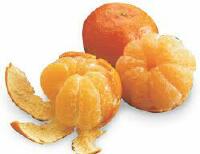
Beautiful label, Sophie. I’m glad the tangerines made their way onto it…
Now it’s my turn to be hated: but please consider to change the capital ‘B’ in the word ‘Based’ to the lower case… lol
ok. I hate you. Feel better? lol
Hey Dorothy, I hate to admit that you are right… I really really really hate it… lol
Any suggestions for a different font? My Quark Xpress doesn’t show the type faces and I don’t want to spend all day looking them up.
I’ll correct the hyphenation… definitely.
Thank you for caring and thank you for having such great eyes. BTW: I never told you how much I love your photography.
May I suggest there’s still a little bit of tweaking to do….I am very sensitive to typefaces, and feel the one chosen for the title feels slightly “hippie”-ish (read: less professional/serious) for me….I also suggest finding a slightly smaller size font so you can get a complete word on a line so you do not have breaks in words. (Se-conds, Ed-ward, Pu-rified, Al-cohol)..Thanks for listening
thank you Audrey
It’s really beautiful, Sophie. And, I love the tangerine addition!
Maybe it’s possible to add the tangerine (connecting symbol) on the label
I can’t see where and how… I’ll see what I can do…
I have made the change. I’ll see about the color… I haven’t gotten a quote yet. Thank you Chyanna.
Sophie – you did a great job! It looks wonderful. I had two thoughts about it – the saturated yellow color might be very costly – obviously you can consult with the printer about that. The other thing you might consider including is a “*disclaimer” saying that it doesn’t actually include the actual Bach flower essences. I say this only to protect yourself from future complainers 🙂 and there may be a misunderstanding with some people.